02 / VISUAL DESIGN
MWLIGHTING
Commercial visual systems for a California lighting manufacturer.
01 / OVERVIEW
Designing forproducts, information,and sales.
MW Lighting is a California-based lighting manufacturer serving commercial and residential markets.
My work focused on translating product information, specifications, photography, and sales messaging into clear visual materials for customers and distributors.
The work ranged from product flyers and promotional campaigns to catalogs, price lists, and product-focused marketing graphics.
Rather than treating each piece as an isolated graphic, the goal was to maintain a recognizable MW Lighting visual language across many different products and formats.
- ROLE
- Graphic Designer
- COMPANY
- MW Lighting
- PERIOD
- 2023 — 2024
- DISCIPLINES
- Graphic Design
- Product Marketing
- Print Design
- Catalog Design
- Photography
- Production Design
02 / THE DESIGN CHALLENGE
Making technicalproducts easy to scan.
Lighting products often contain a large amount of technical information — dimensions, wattage, color temperature, mounting methods, certifications, model numbers, and product variations.
The visual challenge was to organize this information without allowing specifications to overwhelm the product itself.
Each composition needed to balance three priorities:
- 01Product visibility
- 02Technical clarity
- 03Commercial impact
03 / VISUAL LANGUAGE
A flexible visualsystem.
TYPOGRAPHY
Large condensed and bold display typography creates immediate product recognition and gives promotional materials a strong commercial presence.
Supporting information uses simpler, smaller typography to separate technical specifications from primary marketing messages.
COLOR
MW Lighting’s blue was used as the primary visual anchor because it directly connects the materials back to the company’s existing identity.
Neutral whites, grays, and blacks provide room for product photography, while campaign-specific colors such as red, orange, or seasonal tones are introduced when appropriate.
PRODUCT IMAGERY
Products remain the visual focus.
Large product renders, isolated product photography, close-up details, and installation diagrams are used to make technical products easier to understand at a glance.
HIERARCHY
- Product name
- Key visual
- Primary feature
- Specifications
- Certification / contact
The hierarchy is designed so that customers can understand the main product benefit first and inspect technical information afterward.
04 / CATALOG SYSTEM
Organizing a growingproduct catalog.
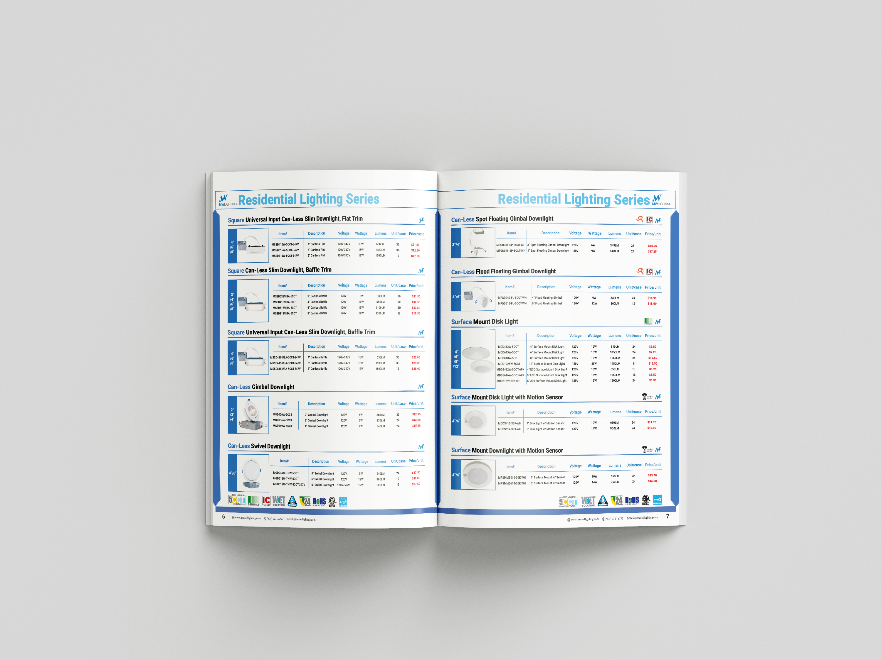
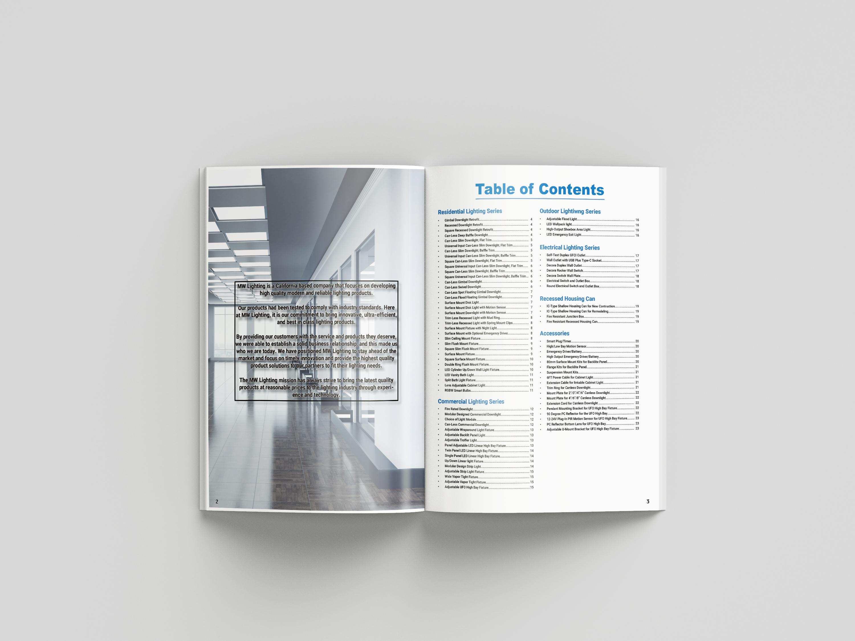
The catalog and price list required a different kind of visual hierarchy from promotional flyers.
Instead of creating a single attention-grabbing composition, these materials needed to organize many products into a system that remained consistent across pages.
Product categories, imagery, pricing, model numbers, and specifications had to remain easy to scan while maintaining the MW Lighting identity.
05 / PRODUCT MARKETING
Turning specificationsinto visual stories.
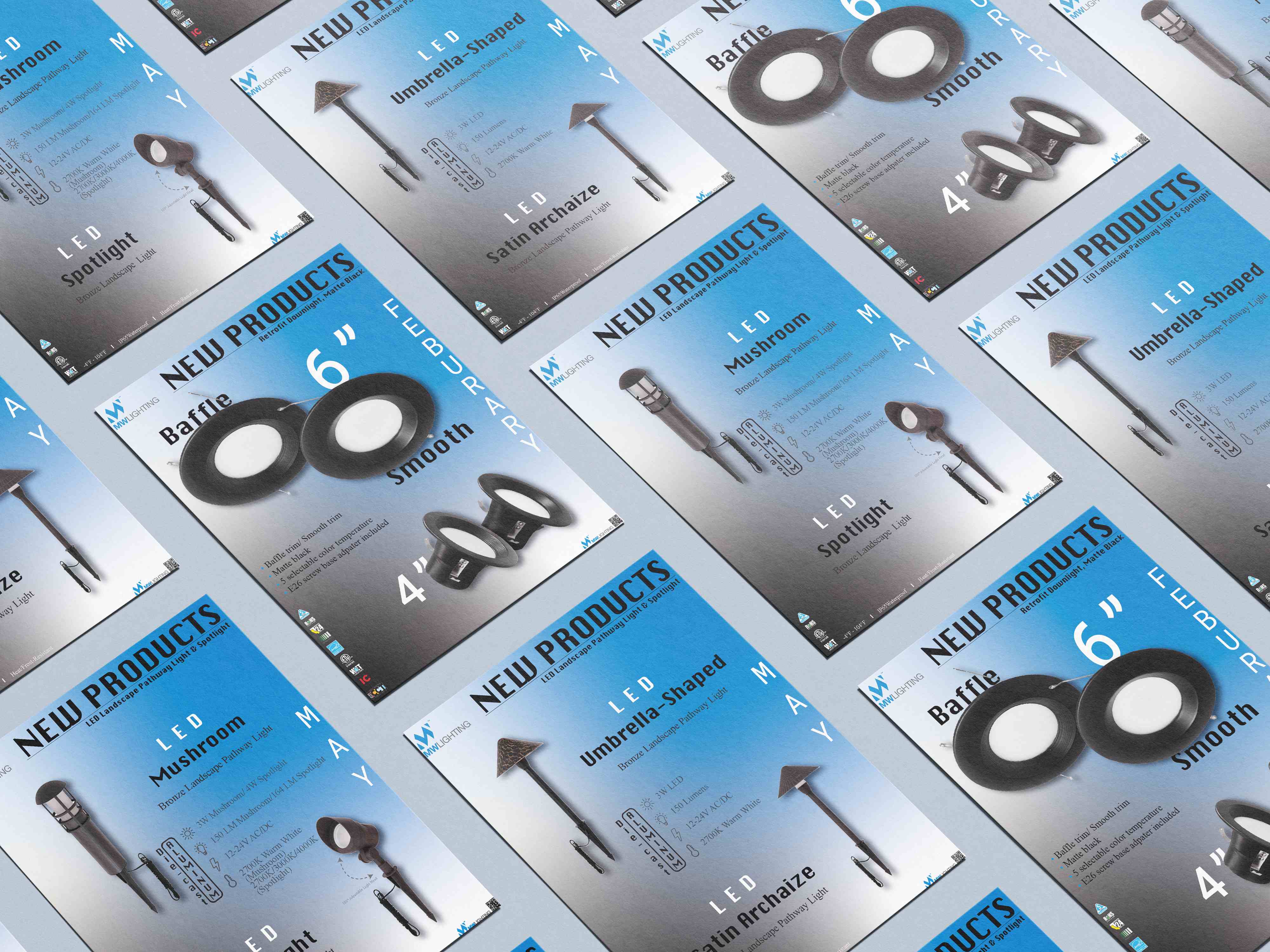
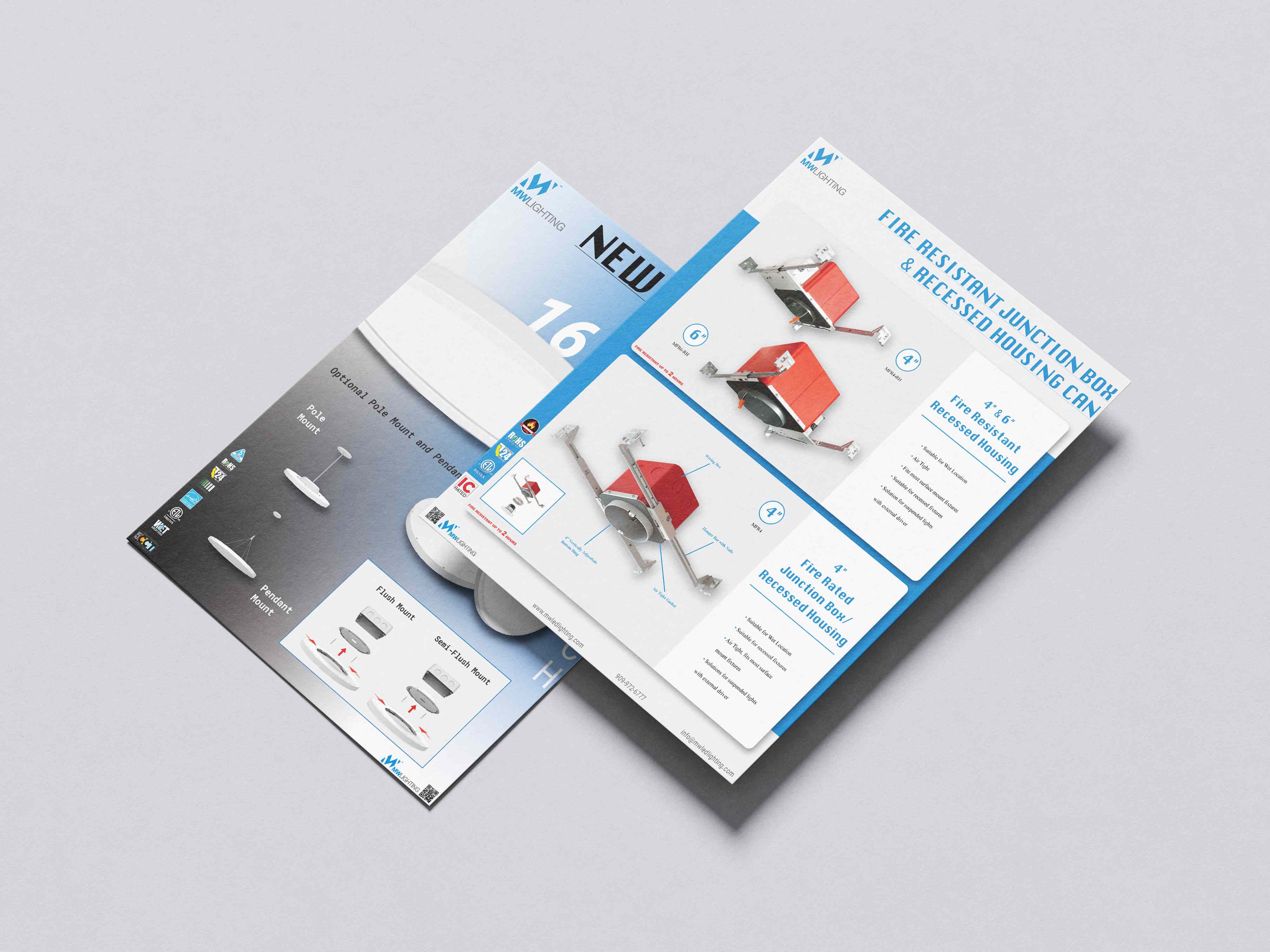
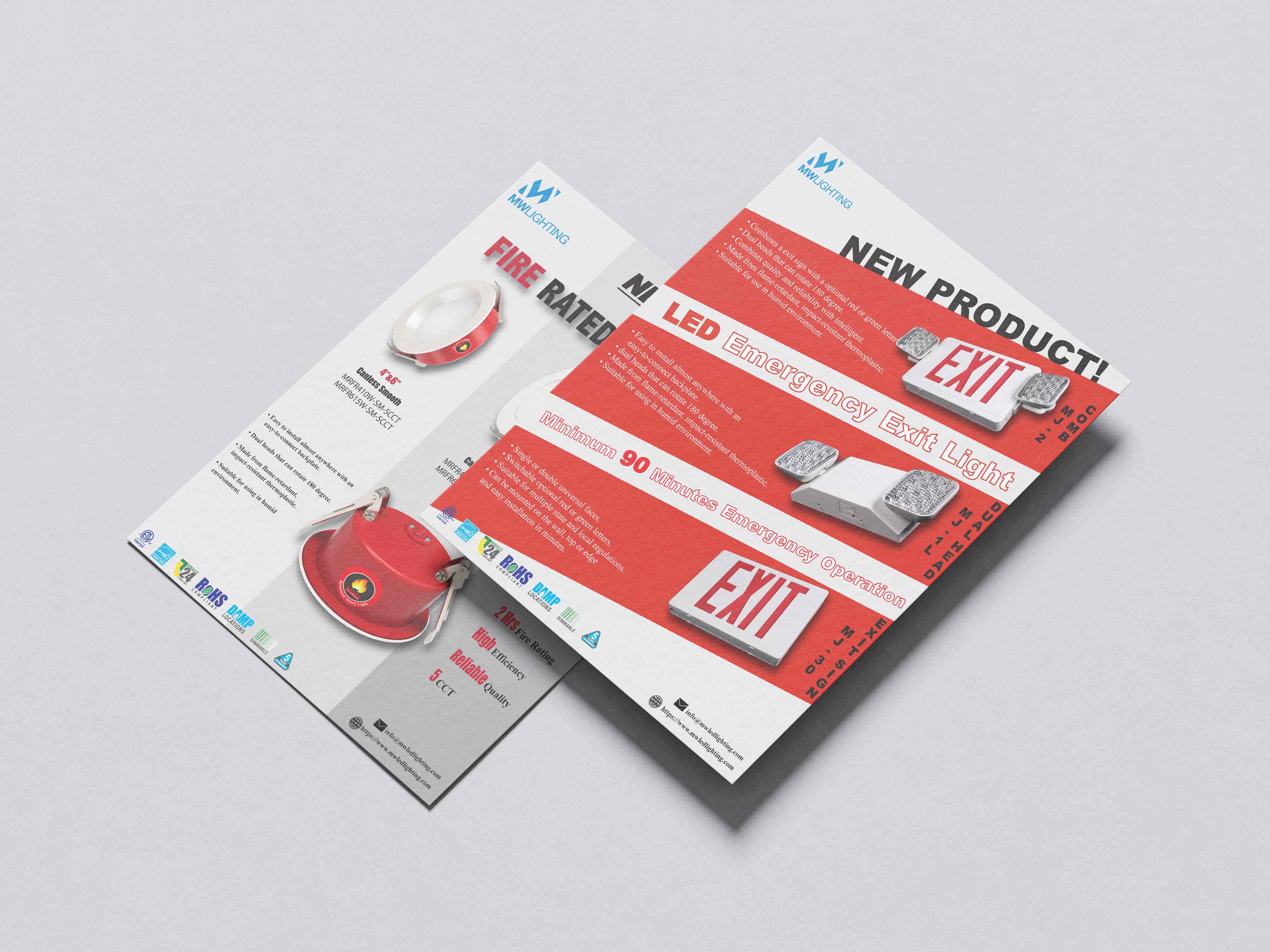
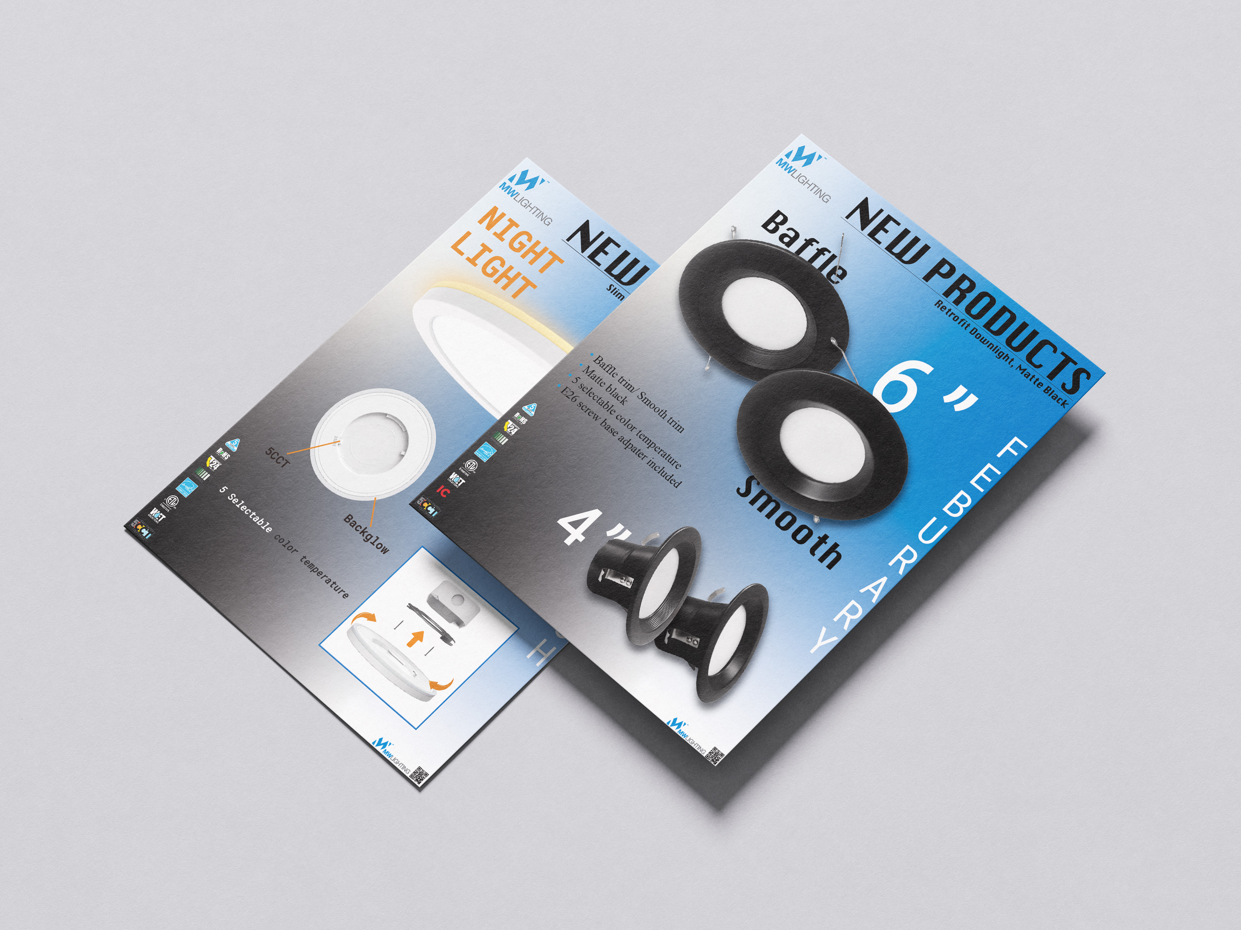
New product announcements required a more immediate visual approach.
Large typography, isolated product imagery, specifications, installation details, and strong contrast were combined to make each product recognizable within seconds.
Although each product had different visual characteristics, the materials retained common structural elements so they still felt like part of the same brand system.
06 / PROMOTIONAL DESIGN
Campaigns could breakthe system — withoutbreaking the brand.
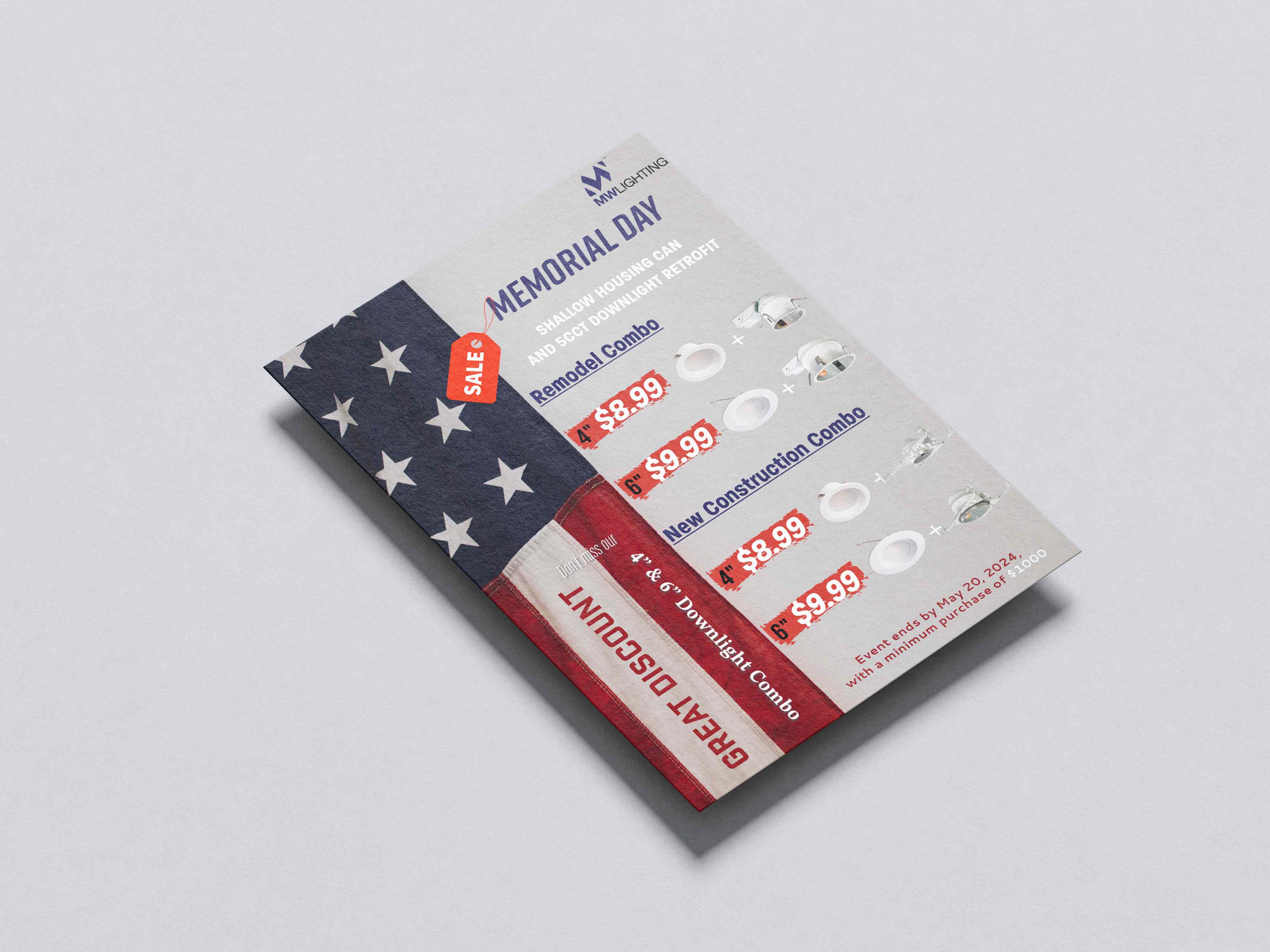
Promotional campaigns allowed the visual system to become more expressive.
Seasonal graphics could introduce stronger imagery, typography, and color while retaining key MW Lighting brand elements.
For example, the Memorial Day promotion combines product photography, pricing, promotional hierarchy, and seasonal visual language within a single sales-focused composition.
07 / PRODUCTION & CONSISTENCY
One brand.Many formats.
The work was designed across different formats and use cases — from single-page product flyers to promotional graphics, catalogs, and pricing materials.
Maintaining consistency meant repeatedly balancing brand recognition with the specific needs of each product.
Rather than applying one rigid template, the system allowed typography, scale, imagery, and color to adapt while maintaining a recognizable MW Lighting visual identity.
- 01Product flyer
- 02Technical flyer
- 03Catalog
- 04Price list
- 05Promotional campaign
08 / SELECTED WORK
Selected work.
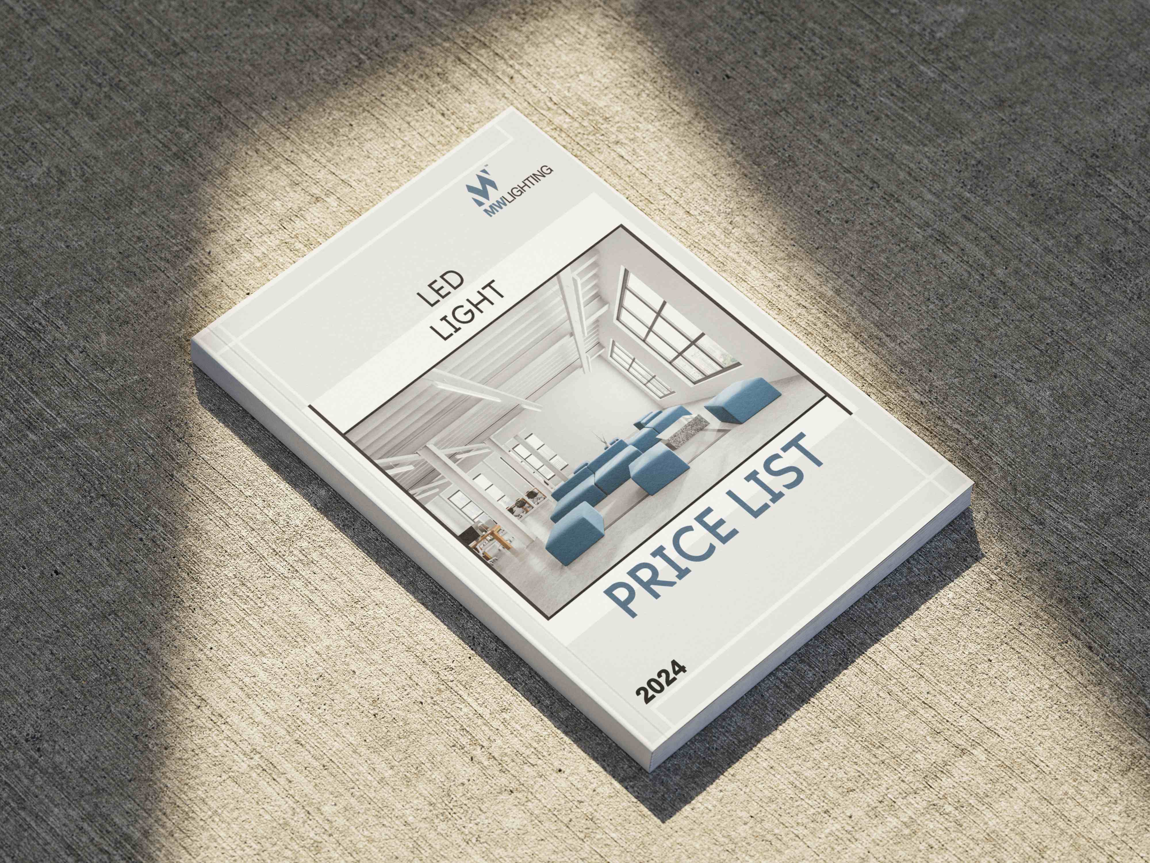
2024 Price List
New Products flyer series
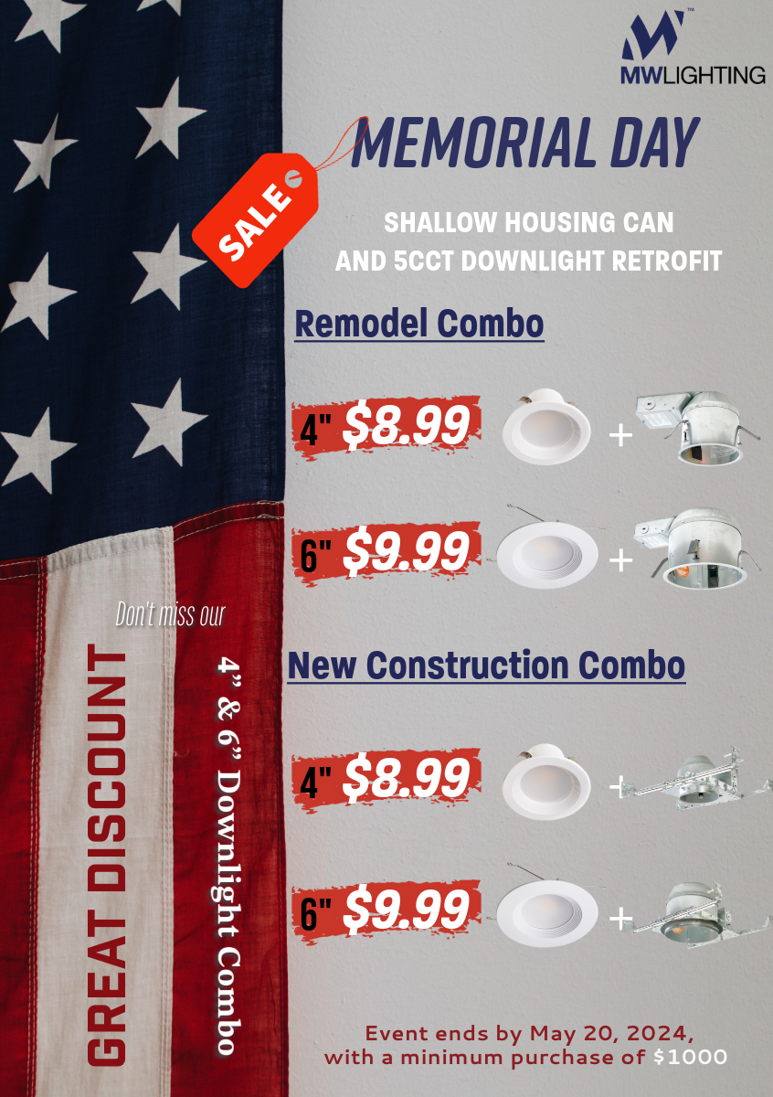
Memorial Day Promotion
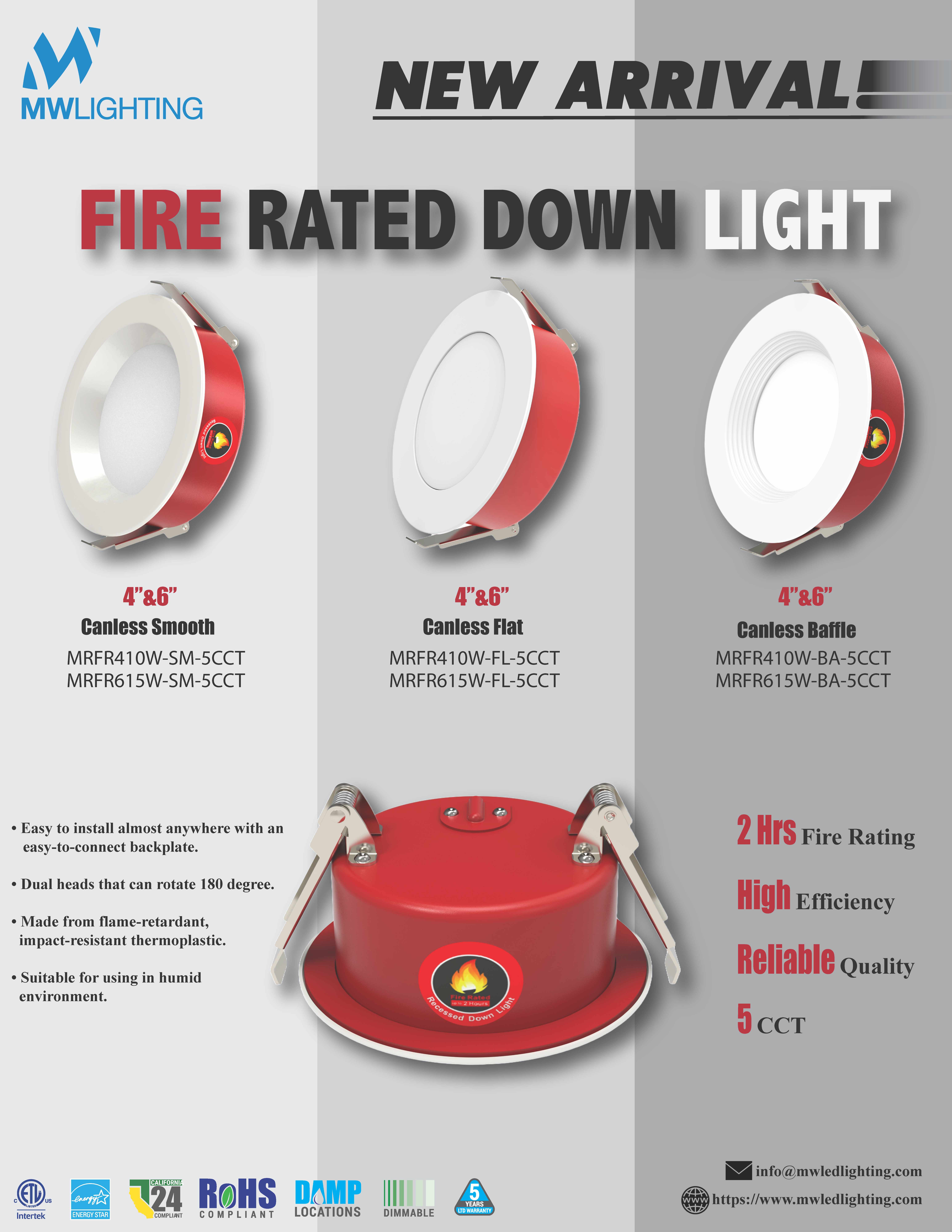
Fire Rated Down Light
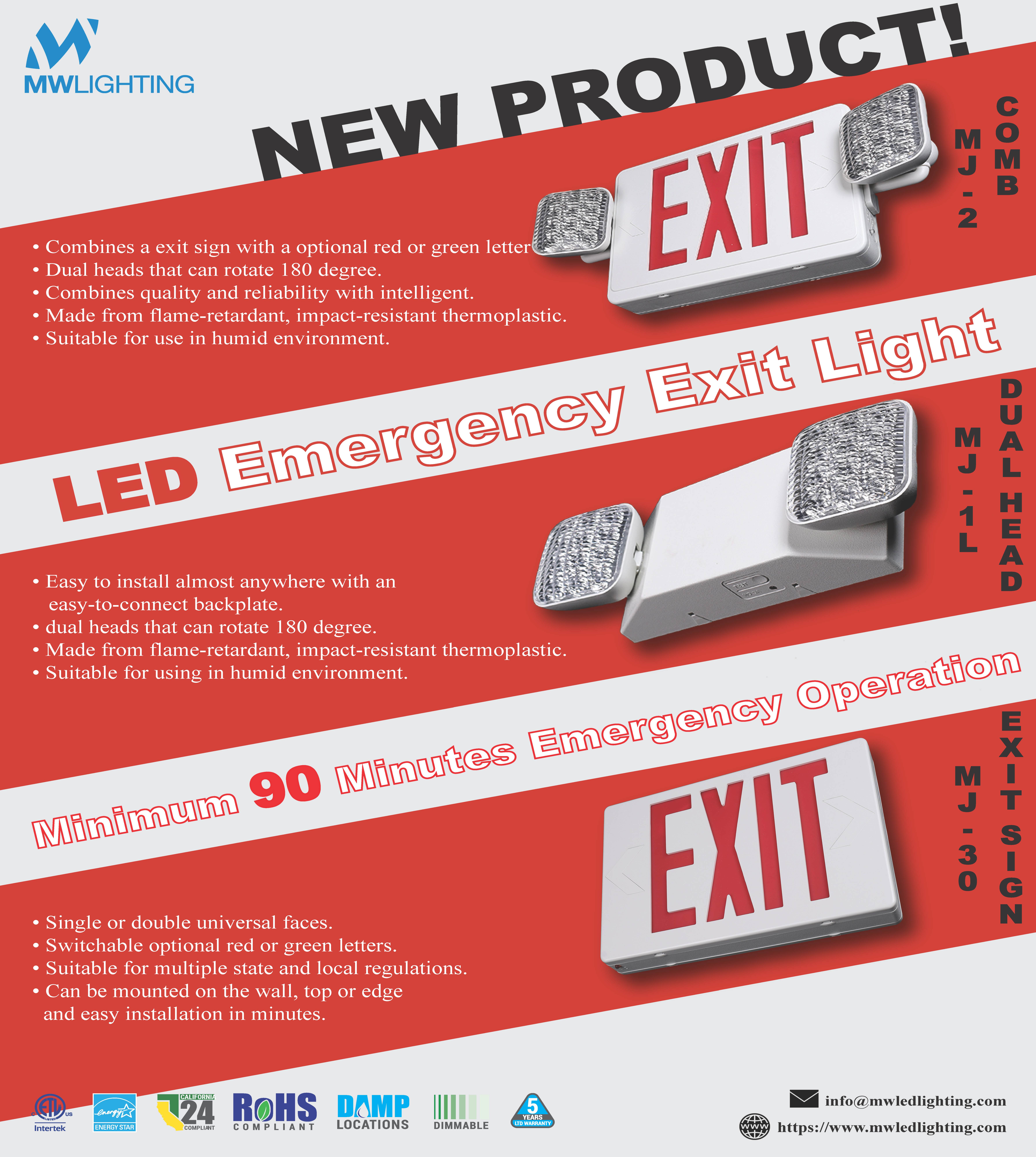
Emergency Exit Light
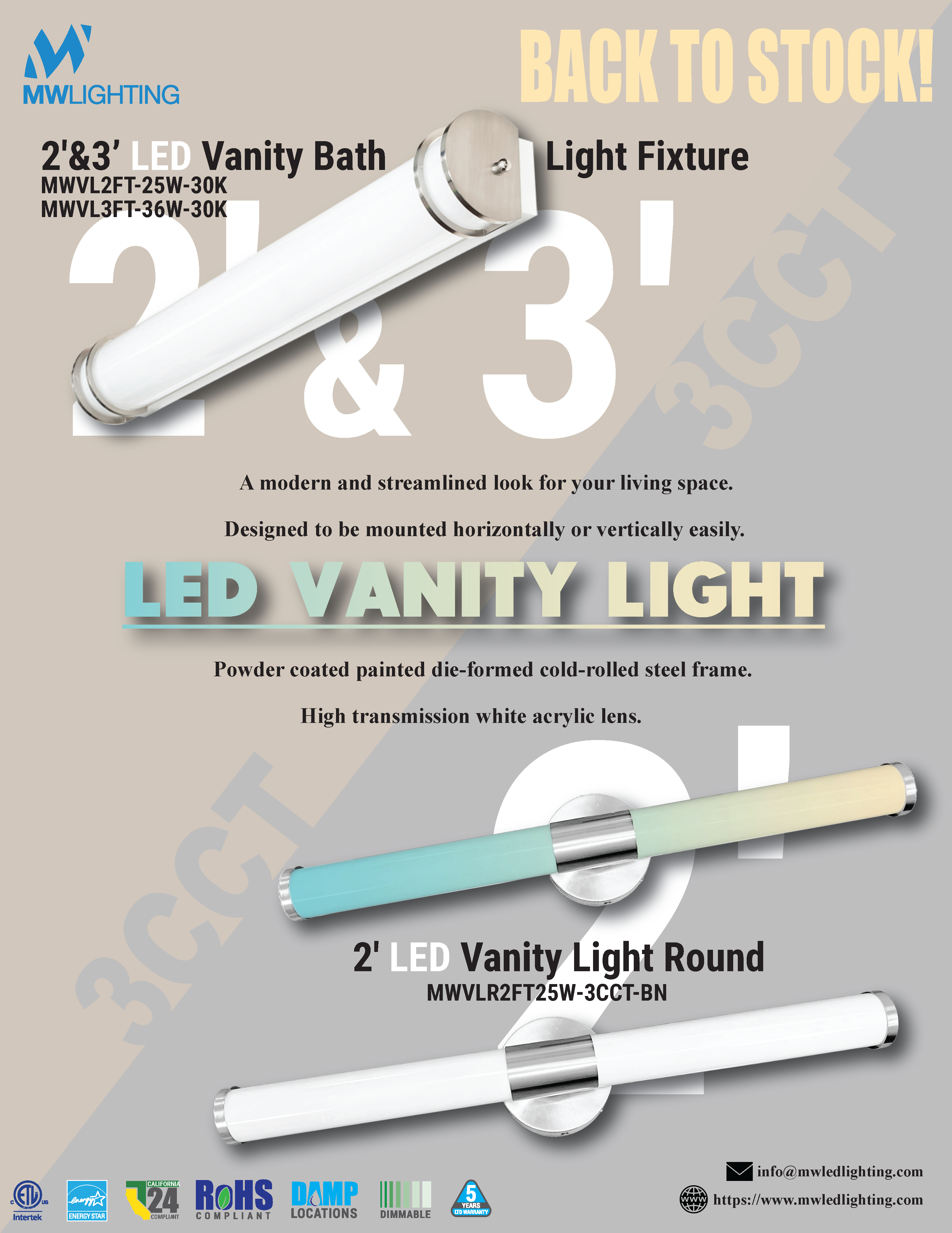
Vanity Light
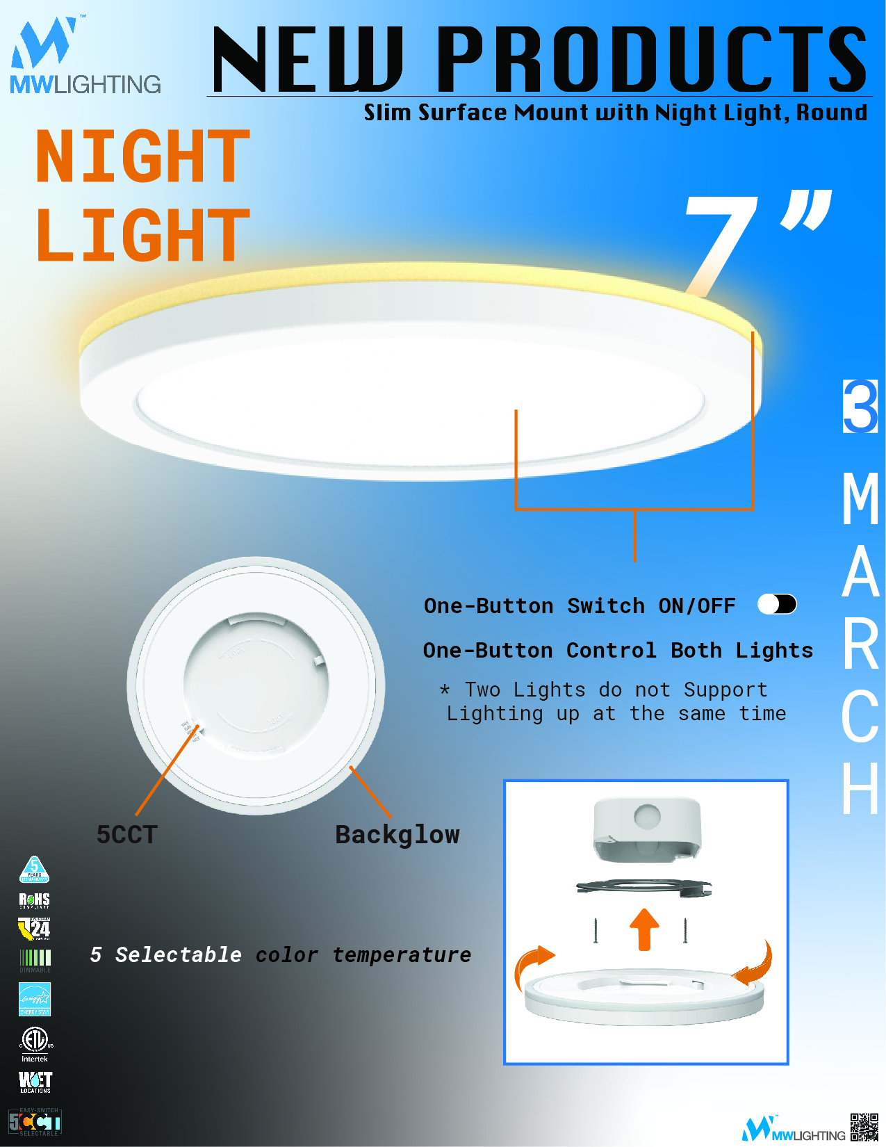
Surface Mount Night Light
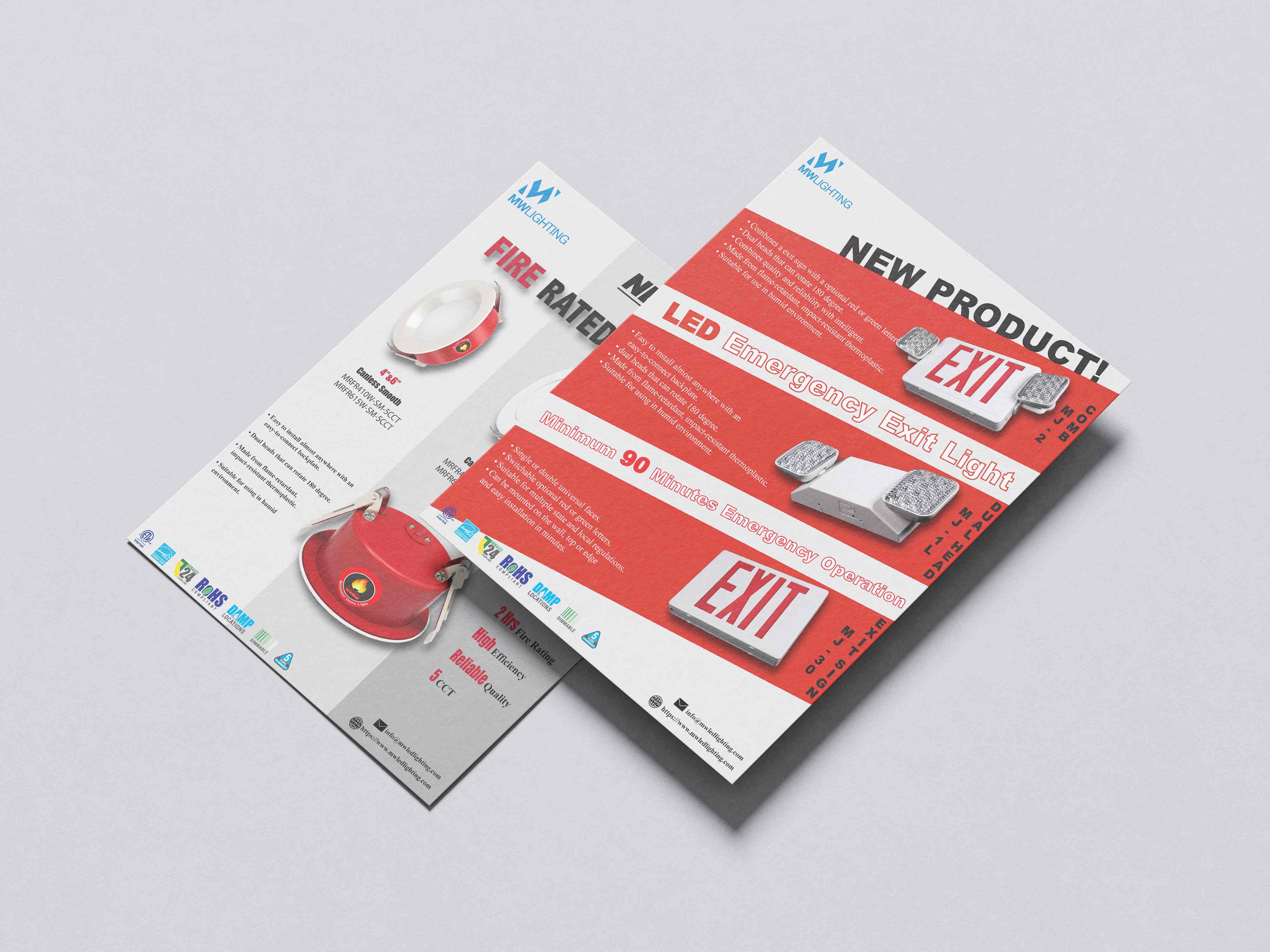
Fire Rated & Exit Light — print
Fire Resistant Housing — print
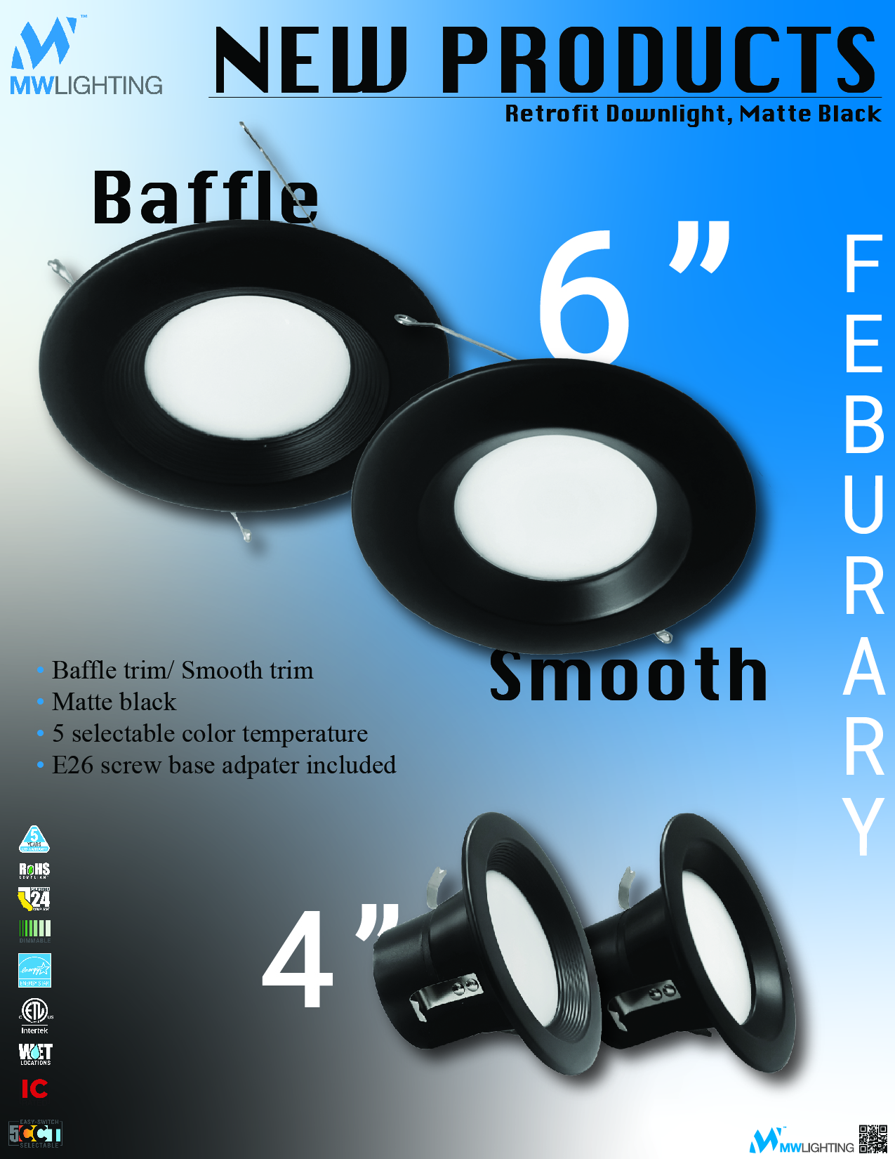
Retrofit Downlight