03 / UX RESEARCH + UI
INTERMOUNTAINHEALING HEARTS
A responsive nonprofit website redesign focused on donation discoverability and sponsor engagement.
- CLIENT
- Intermountain Healing Hearts
- PROJECT
- Website Redesign
- PROJECT TYPE
- UX / UI Team Project
01 / PROJECT CONTEXT
Improving how peoplesupport the community.
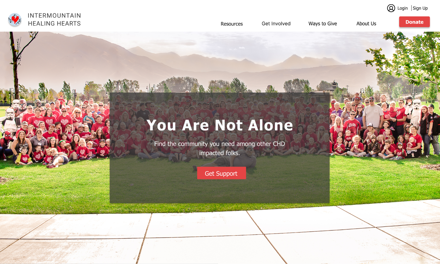
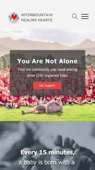
Intermountain Healing Hearts is a nonprofit organization supporting children and families affected by congenital heart disease.
The redesign explored how the website could better support three important goals identified during the project.
- 01Registration
- 02Engagement
- 03Donations
These three goals came directly from the original project objective. This case study documents the collaborative research and design process completed by the project team.
- 01 / DISCOVER
- 02 / DEFINE
- 03 / DEVELOP
- 04 / DELIVER
Understanding theorganization first.
RESEARCH / STAKEHOLDER INTERVIEWS
What mattered tothe organization?
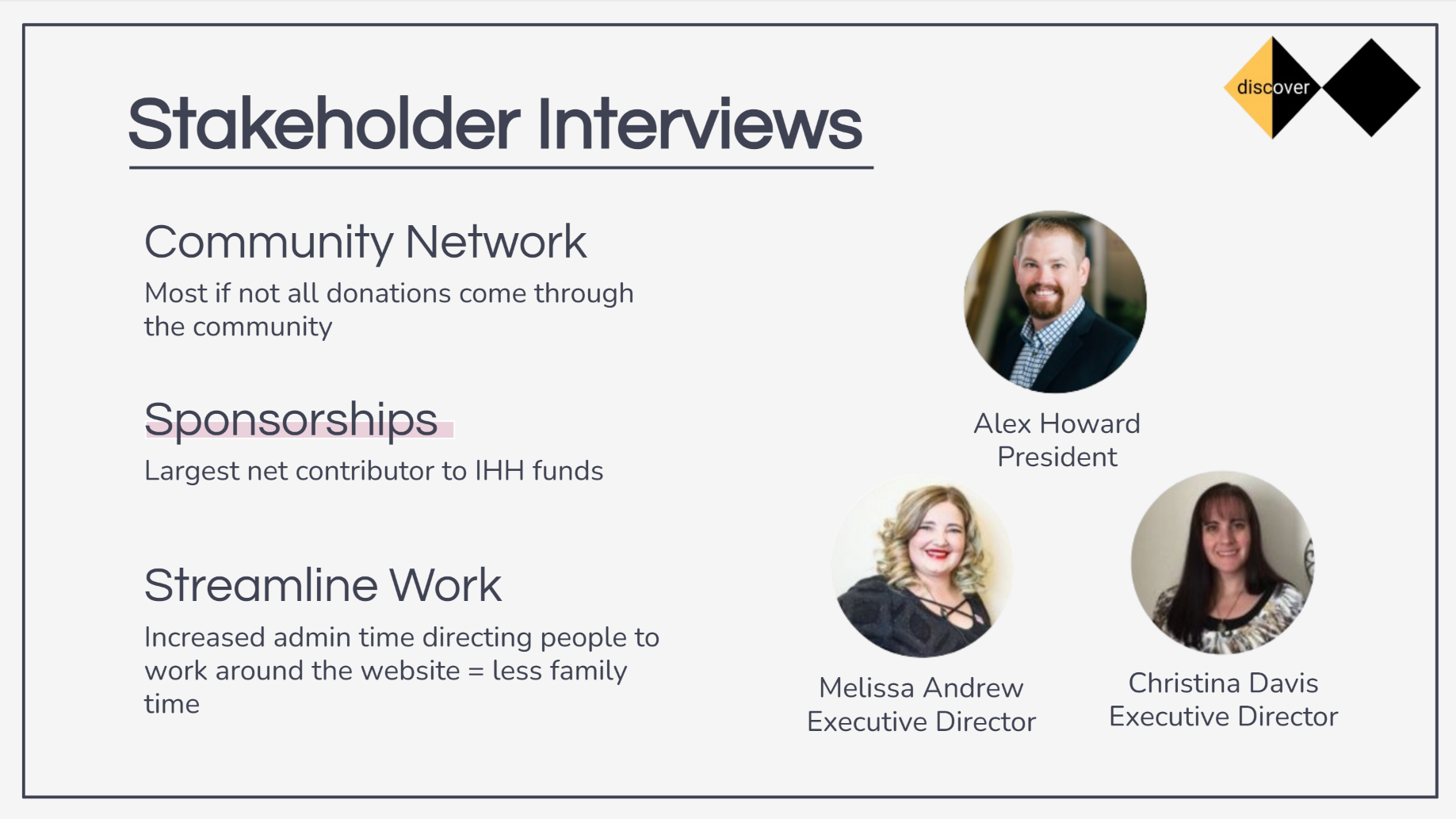
- Alex Howard
- PRESIDENT
- Melissa Andrew
- EXECUTIVE DIRECTOR
- Christina Davis
- EXECUTIVE DIRECTOR
COMMUNITY NETWORK
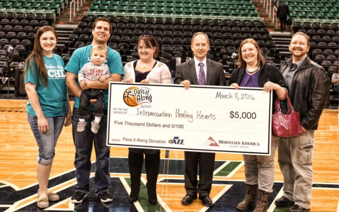
Most if not all donations come through the community.
SPONSORSHIPS
Largest net contributor to IHH funds.
STREAMLINE WORK
Increased administrative time directing people around the website reduces time available for families and other work.
RESEARCH / SURVEY
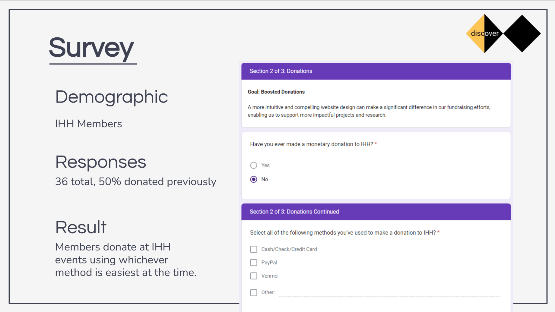
How were memberscurrently donating?
Members donate at IHH events using whichever method is easiest at the time.
RESEARCH / COMPETITIVE LANDSCAPE
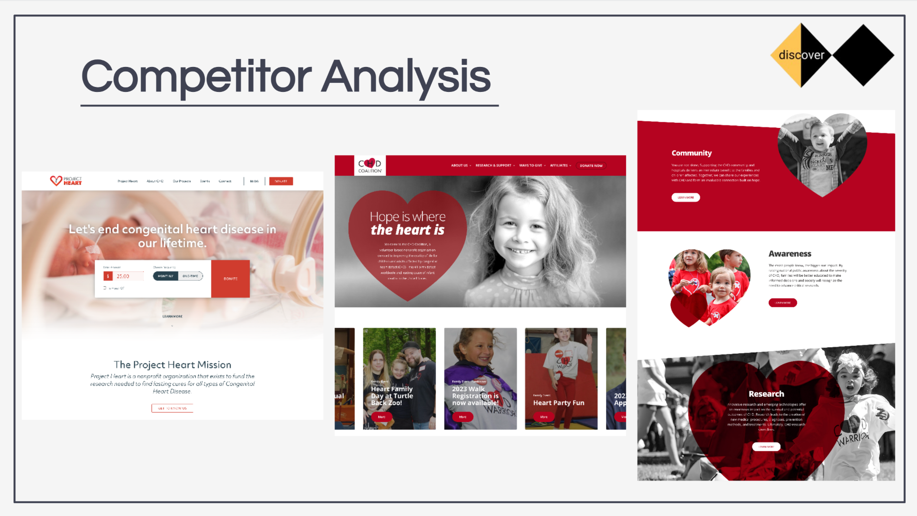
How were similarorganizations communicating?
The team reviewed comparable nonprofit websites to understand common approaches to donation visibility, storytelling, community information, and calls to action.
This helped provide context for how IHH’s existing experience could be reorganized.
RESEARCH / USABILITY TEST
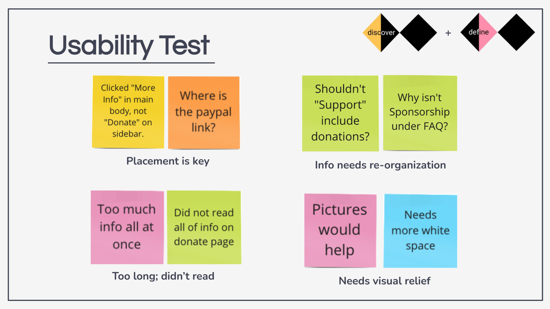
The problem was nota lack of information.
It was finding it.
- 01 / OBSERVATION
Placement is key
“Clicked ‘More Info’ in main body, not ‘Donate’ on sidebar.”
“Where is the PayPal link?”
- 02 / OBSERVATION
Information needs reorganization
“Shouldn’t ‘Support’ include donations?”
“Why isn’t Sponsorship under FAQ?”
- 03 / OBSERVATION
Too long; didn’t read
“Too much info all at once.”
“Did not read all of info on donate page.”
- 04 / OBSERVATION
Needs visual relief
“Pictures would help.”
“Needs more white space.”
- 01 / DISCOVER
- 02 / DEFINE
- 03 / DEVELOP
- 04 / DELIVER
Turning researchinto a focused problem.
DEFINE / PROBLEM STATEMENT
Finding a way to giveshould not be difficult.
“Prospective donors/business partners have a hard time locating ways to donate/sponsor which leads to losses in prospective funding and revenue.”
“By designing intuitive navigation and streamlining processes, prospective donors/business partners can easily send donations/inquiries which potentially increases overall funding.”
DEFINE / PERSONA
Expanding the audiencefrom member to sponsor.
The project originally considered a member-focused persona. As research pointed toward sponsorships as the largest net contributor to IHH funds, the team introduced a sponsor-focused persona.
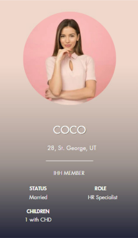
Coco
- AGE
- 28
- LOCATION
- St. George, UT
- ROLE
- IHH Member
- Struggles to balance her job and her family
- Grateful for the IHH community and feels less alone
- Wants to contribute back to IHH through volunteering or attending events
- Financially strained from medical treatments for her son
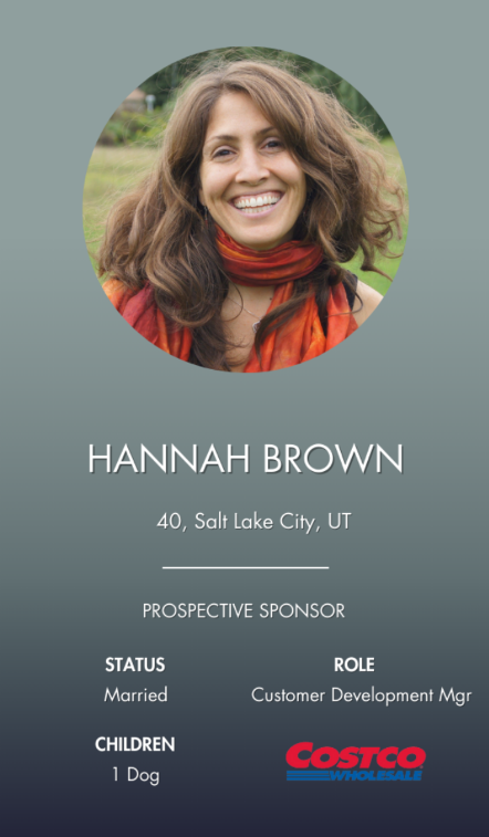
Hannah Brown
- AGE
- 40
- LOCATION
- Salt Lake City, UT
- ROLE
- Prospective Sponsor
- STATUS
- Married
- CHILDREN
- 1 Dog
- POSITION
- Customer Development Mgr
- ORGANIZATION
- Costco
- Partner with local nonprofits to meet quarterly quota
- Find local nonprofits that align with the company’s values
- Needs an easy way to reach out to nonprofits
- Needs an ETA after initial outreach
DEFINE / SYNTHESIS
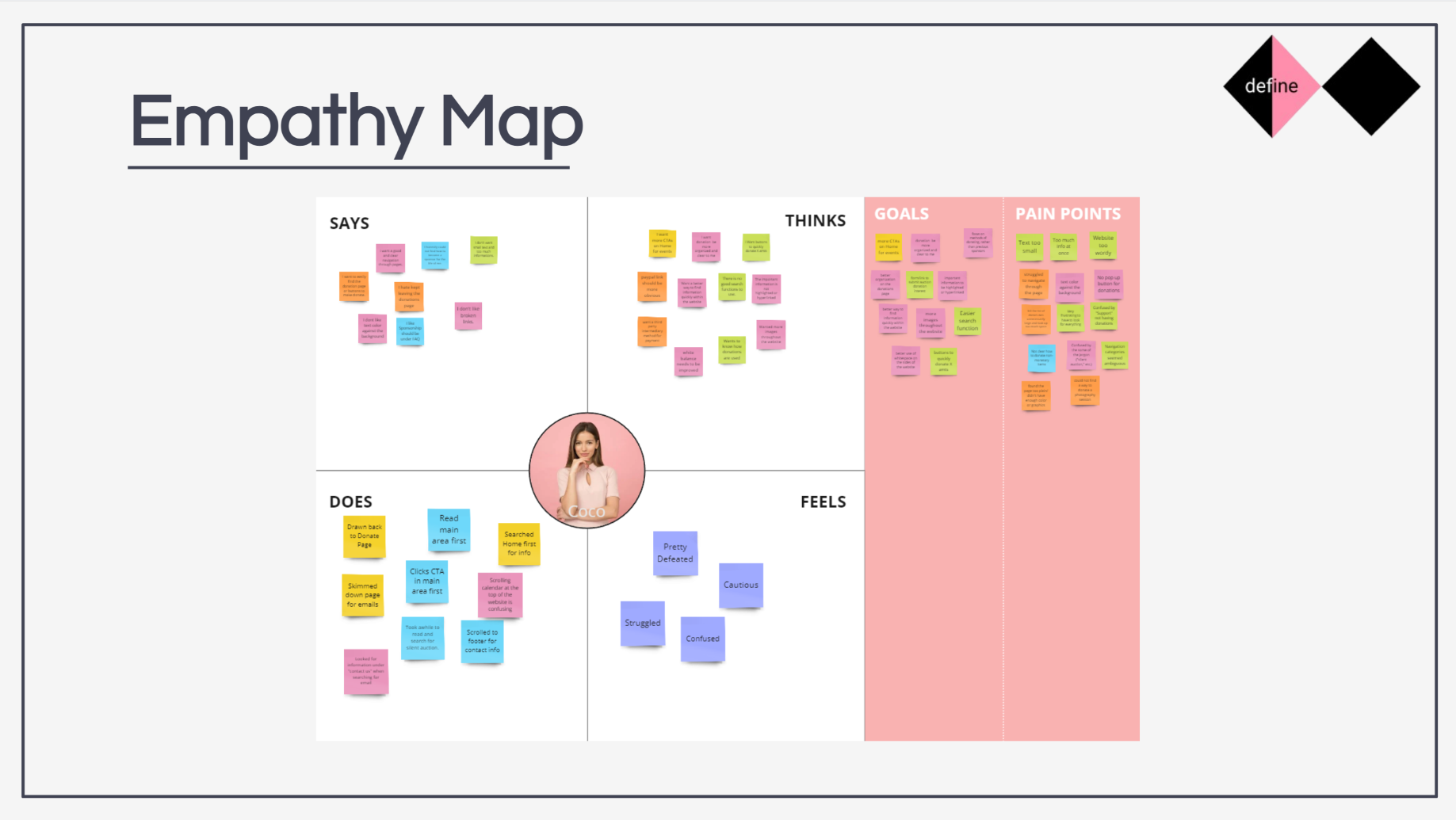
Mapping what userssay, think, do, and feel.
DEFINE / SCENARIO
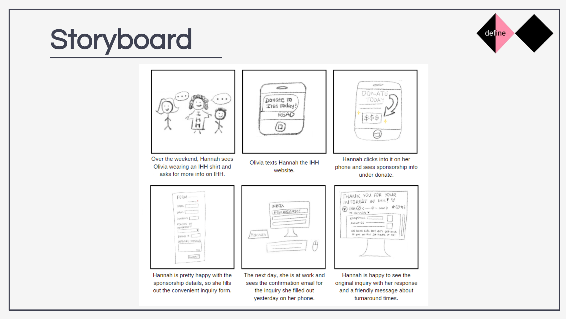
Designing arounda real sponsorship journey.
Hannah discovers IHH through a colleague, visits the website, finds sponsorship information, submits an inquiry, receives confirmation, and later receives a response.
DEFINE / USER JOURNEY
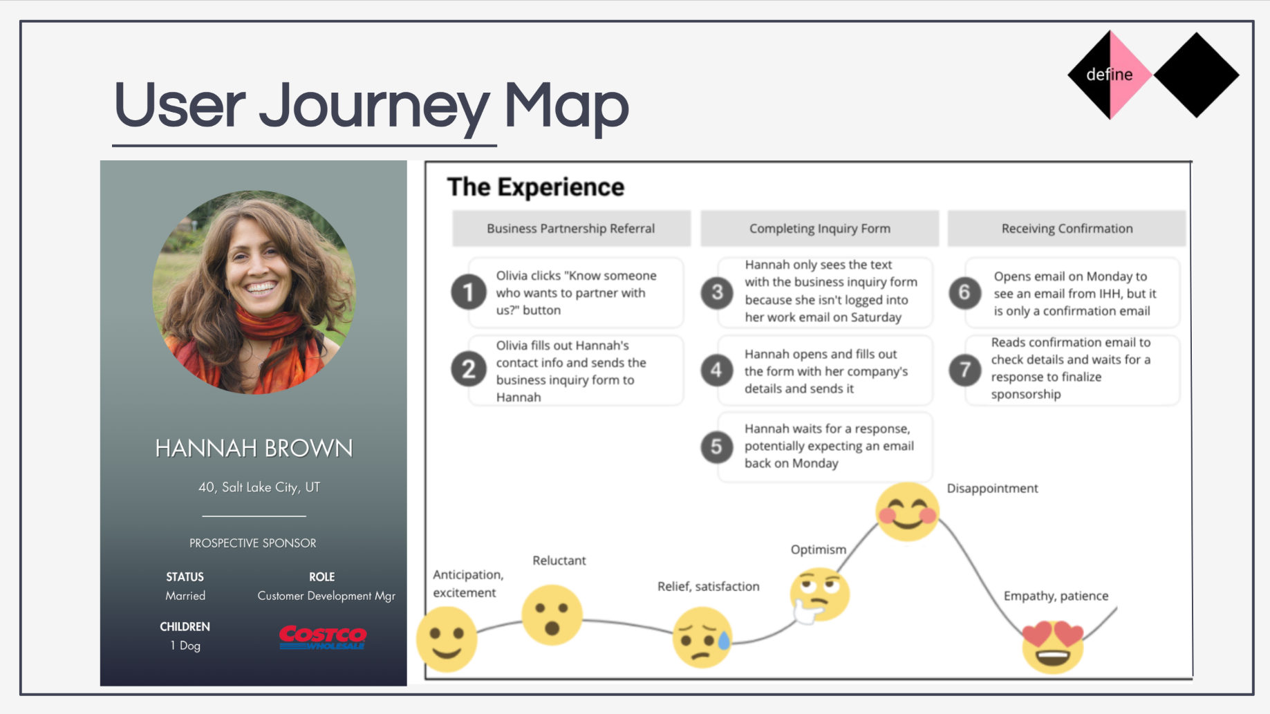
The experience did notend at form submission.
- STAGE 01Business Partnership Referral
- STAGE 02Completing Inquiry Form
- STAGE 03Receiving Confirmation
- 01 / DISCOVER
- 02 / DEFINE
- 03 / DEVELOP
- 04 / DELIVER
Moving from ideasto structure.
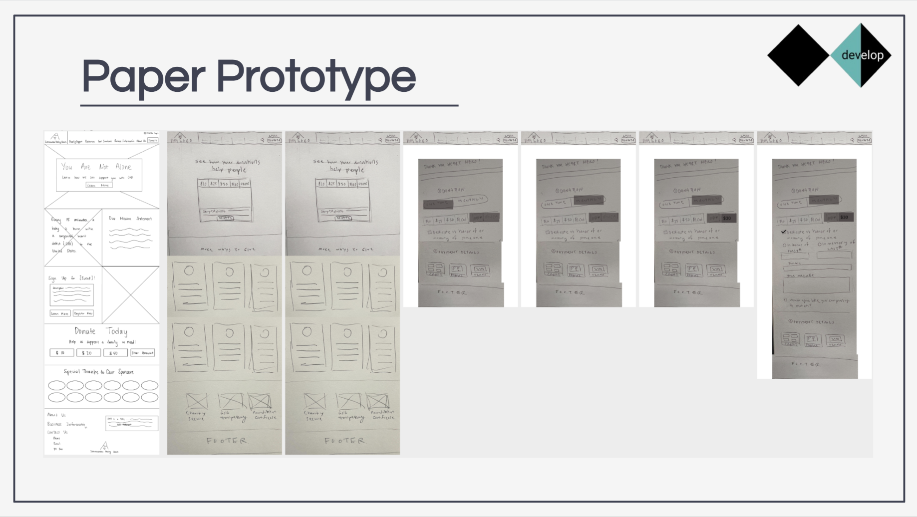
DEVELOP / LOW FIDELITY
Starting with thecontent hierarchy.
Early sketches explored how homepage content, donation information, sponsorship information, and supporting content could be reorganized before visual styling was introduced.
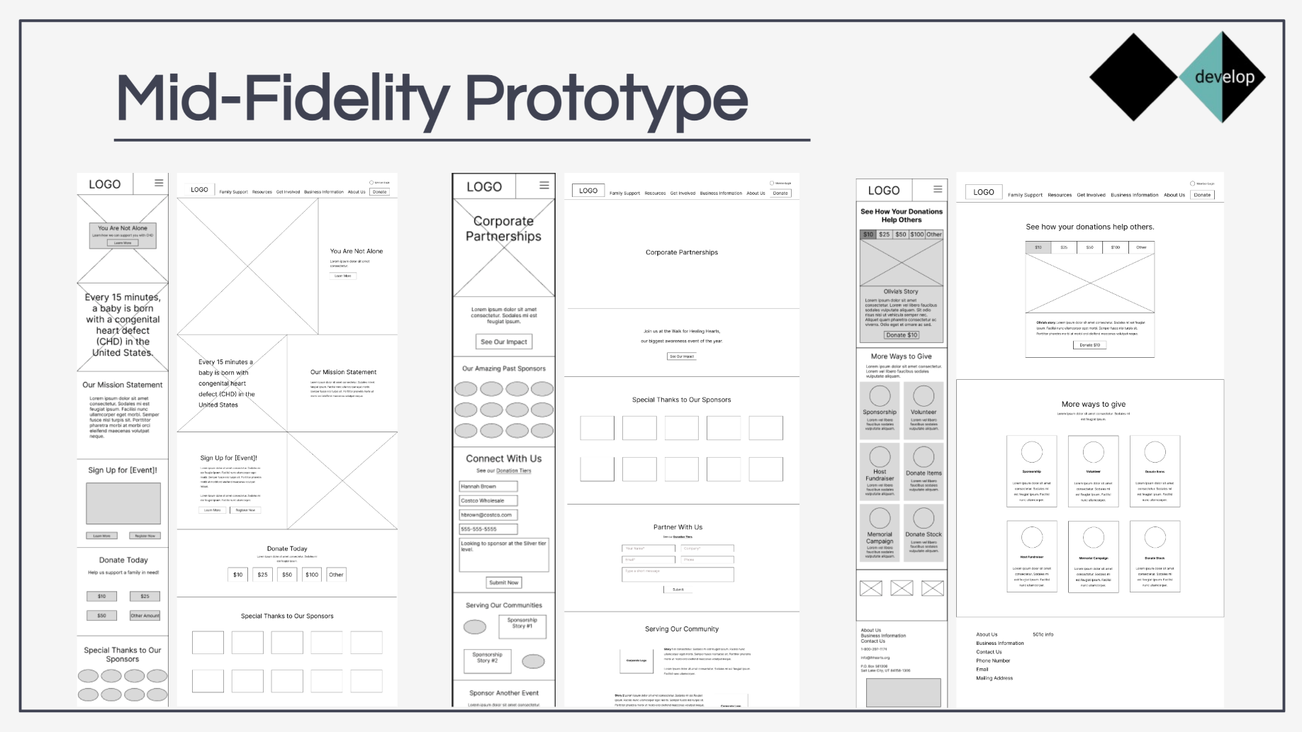
DEVELOP / MID FIDELITY
Testing structurebefore visual polish.
Mid-fidelity desktop and mobile wireframes translated the paper sketches into structured, responsive layouts.
DELIVER / DESIGN RESPONSE
Answering whatthe research showed.
- 01
Clearer navigation
Key actions such as donations and sponsorship information became easier to locate.
- 02
Stronger information hierarchy
Long blocks of information were reorganized into more digestible visual sections.
- 03
Responsive experience
Desktop and mobile interfaces were designed as part of the same system.
FINAL PROTOTYPE
Explore the prototype.
NEXT STEPS
The project ended.The questions did not.
Proposed next steps from the original project — not yet completed.
- 01Continue iterating the hi-fidelity prototype using 5-second testing results.
- 02Research and develop the sponsorship link sharing feature from the events page.
- 03A/B testing on the donation checkout process.
PROJECT PROCESS
Two diamonds,four phases.
- DISCOVER
- Stakeholder Interviews
- Survey
- Competitor Analysis
- Usability Test
- DEFINE
- Problem Statement
- Persona
- Empathy Map
- Storyboard
- User Journey
- DEVELOP
- Paper Prototype
- Mid-Fidelity Prototype
- DELIVER
- Responsive High-Fidelity Prototype
Intermountain Healing Hearts Redesign was completed as a collaborative UX design project.
This case study presents the shared research and design process documented in the original project materials.
Individual responsibilities are intentionally not attributed where the original project documentation does not clearly identify ownership.